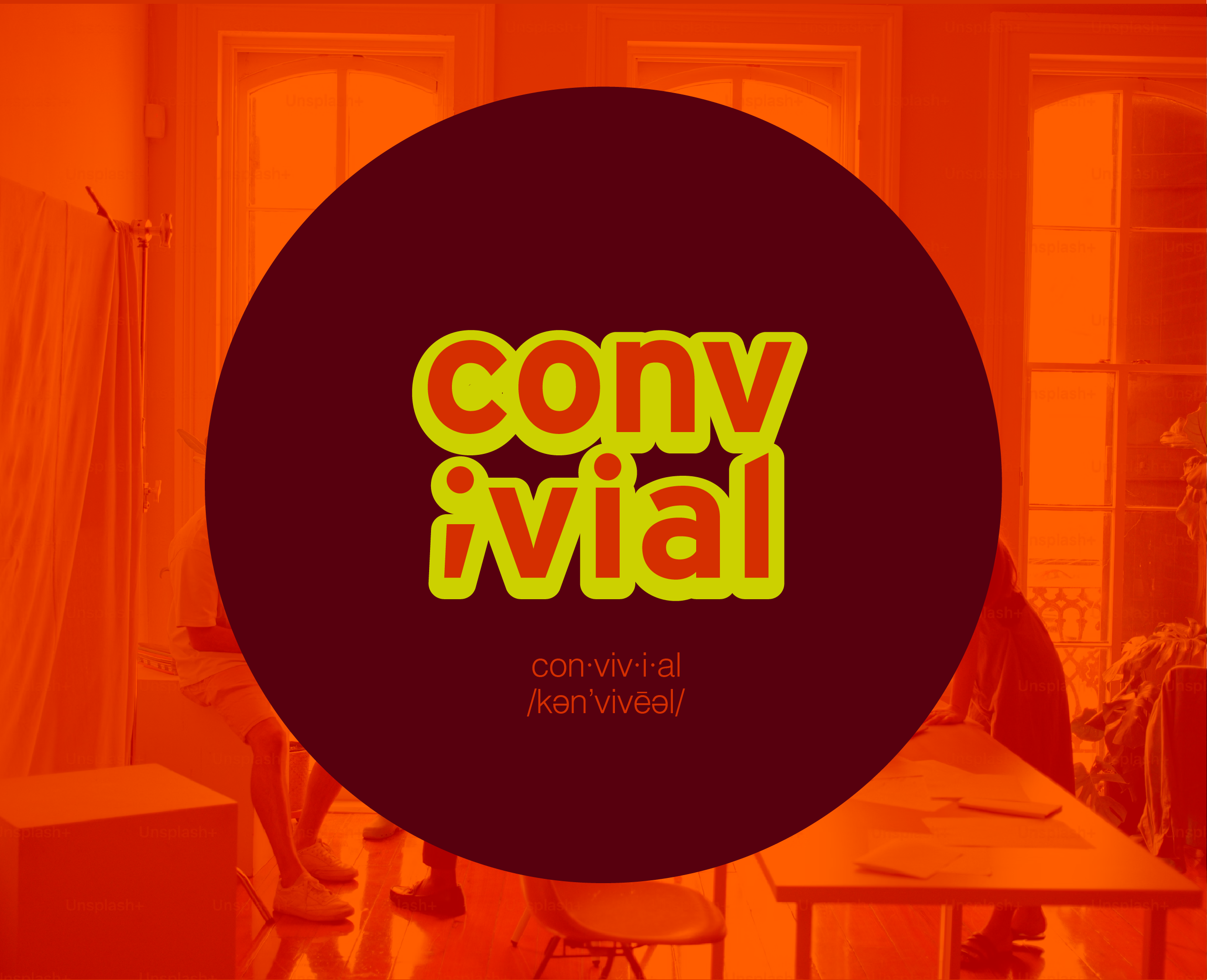
Convivial- A Community Space
Logo Design and Brand Guide
Convivial- A Community Space
Logo Design and Brand Guide
Victor Shemper was commissioned to design the brand guidelines and logo for a community
space in Brooklyn. The client sought a warm and welcoming visual identity that would be
eye-catching and reflect the spirit of culture and community. The space emphasizes creative
outlets for all people, and finding creativity within the gaps of time in your life.

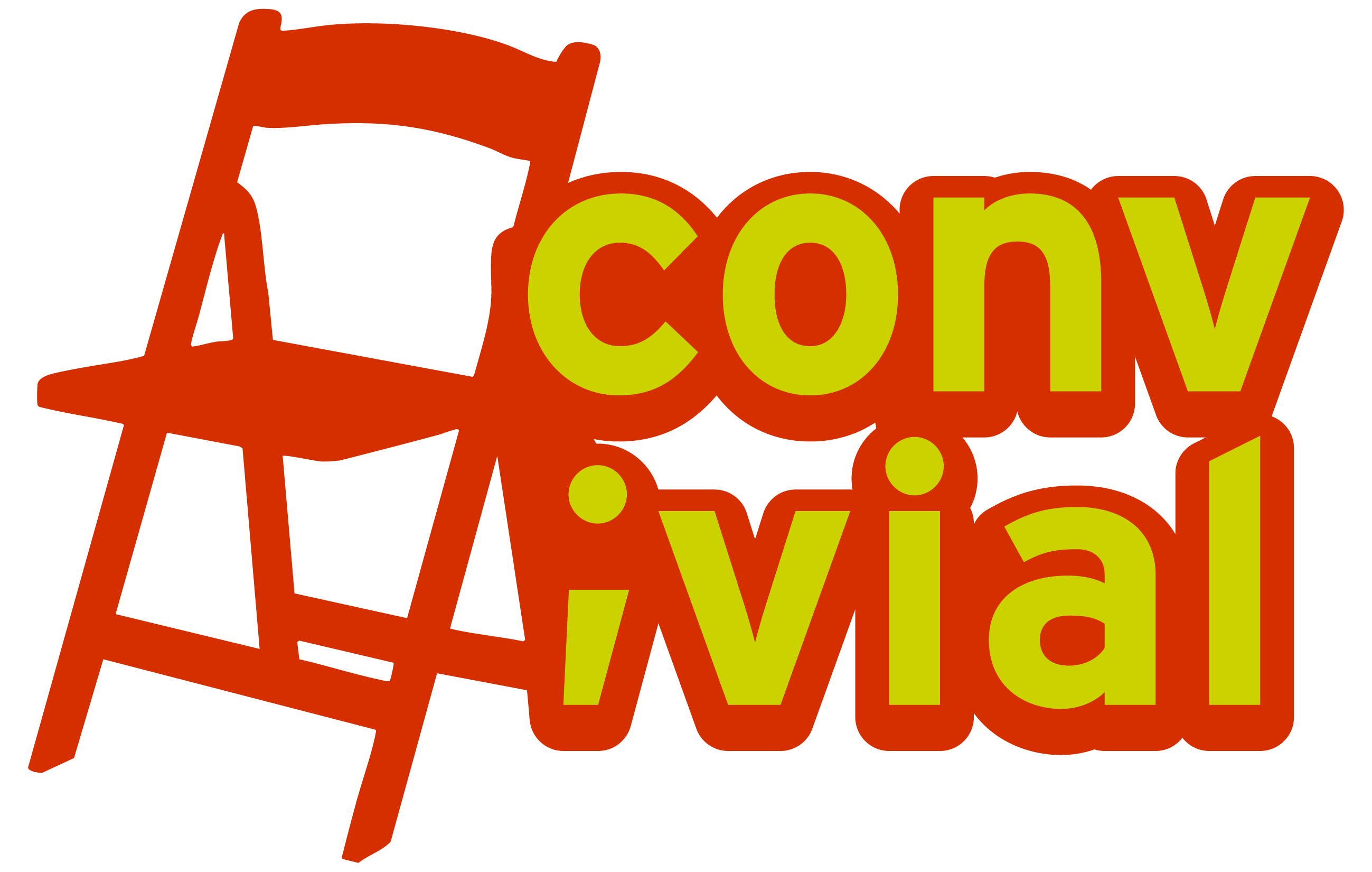
The Convivial Logo:
The client requested a versatile logo that could be taken apart and put back together,
while still capturing a consistent energy.


The wordmark uses Interstate—a clean, familiar typeface—to establish a sense of comfort while allowing
room to experiment with color and usage.
The letter “i” is replaced with a semicolon, symbolizing the act of bringing two things together: community.
![]()
![]()
![]()
The pictorial logo features a folding chair, commonly found in creative community spaces. It suggests a
place where people can come and go freely—a welcoming environment open to all. A seat for everyone.
![]()
![]()
![]()
The colors of the identity are inspired by those commonly found in comfort food, elevated to a graphic,
eye-catching level. The palette maintains a sharpness while evoking familiar, comforting associations
room to experiment with color and usage.
The letter “i” is replaced with a semicolon, symbolizing the act of bringing two things together: community.


The pictorial logo features a folding chair, commonly found in creative community spaces. It suggests a
place where people can come and go freely—a welcoming environment open to all. A seat for everyone.


The colors of the identity are inspired by those commonly found in comfort food, elevated to a graphic,
eye-catching level. The palette maintains a sharpness while evoking familiar, comforting associations


